/ 01
The problem
Most people who are struggling never reach a therapist. It feels too clinical or too expensive, or the problem doesn't seem 'serious enough'. Students, under-18s and new mothers are often in exactly that gap. Conditions like postpartum depression barely get talked about in India.
Meanwhile the clinicians who are available get every case, mild or severe. Our idea was to route people by need, so specialists see the people who need them and everyone else still gets someone to talk to.
/ 02
Approach
We split the service into two tracks. The therapist track connects people with psychiatrists, psychotherapists and music therapists. The volunteer track pairs mild cases, students and under-18s with final-year psychology and MBBS students and interns.
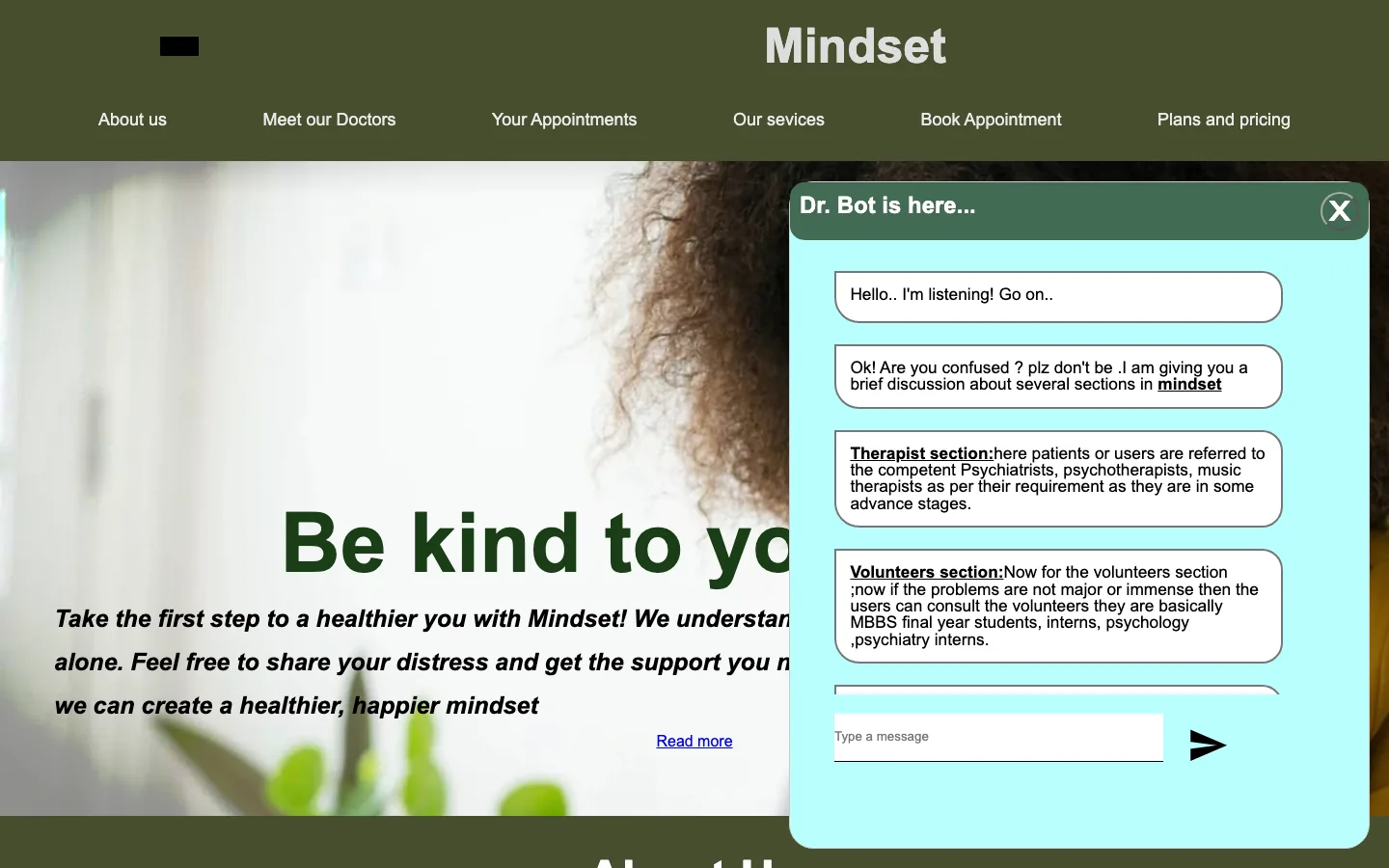
A guide bot on the home page explains the difference in plain words and points people to the right track. That way nobody has to work out on their own whether their problem is 'big enough' for a doctor.
We had two days. I took the account system and the booking data. I reused and extended the sign-up and login screens from my Campus Exchange project and added Google sign-in. Then I connected both booking forms to Firebase so a booking survives a refresh and shows up again under 'Your appointments'.
/ 03
What I built
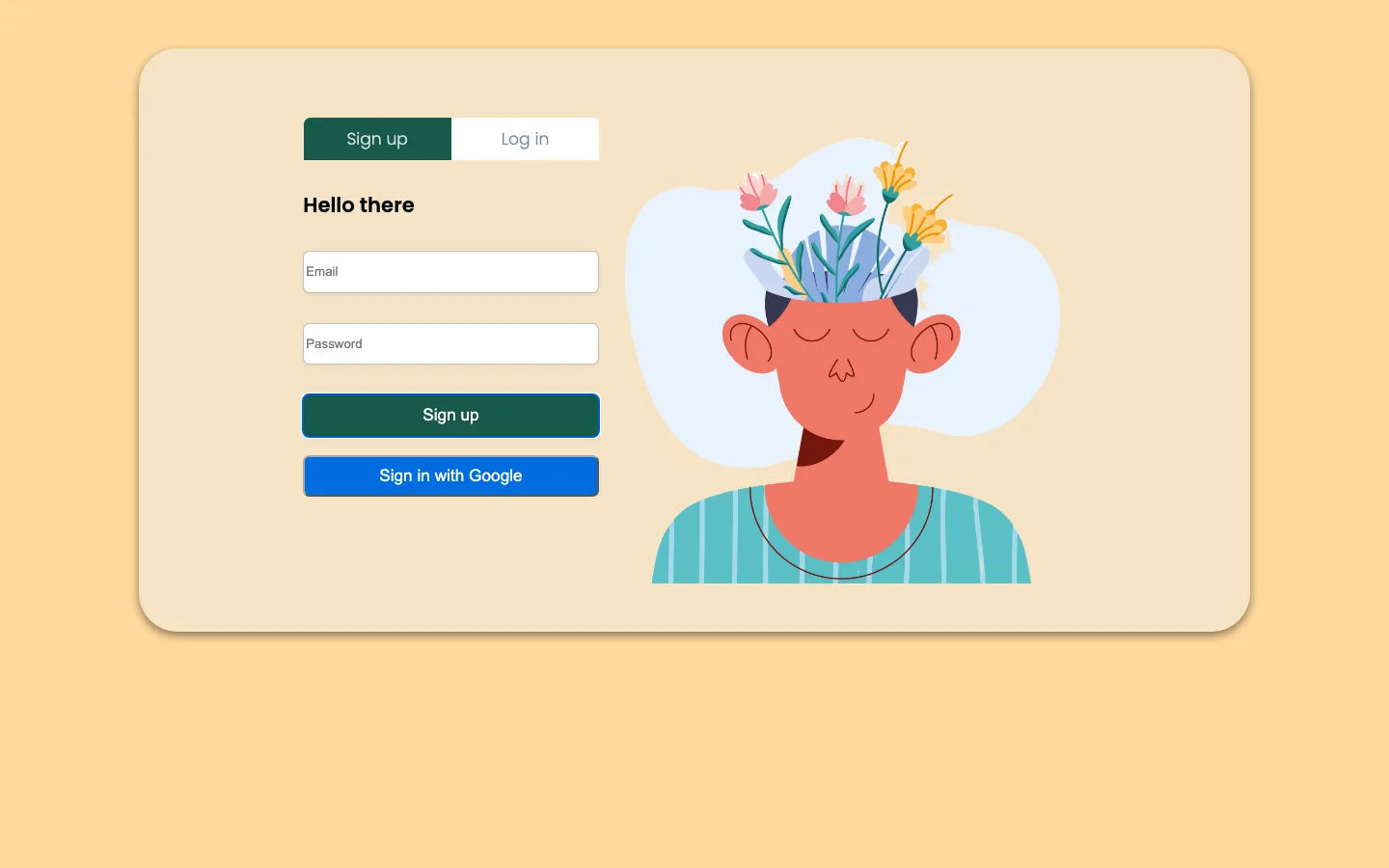
Sign in with email or Google
A two-tab card for signing up or logging in. Google sign-in is a single popup through Firebase Auth.
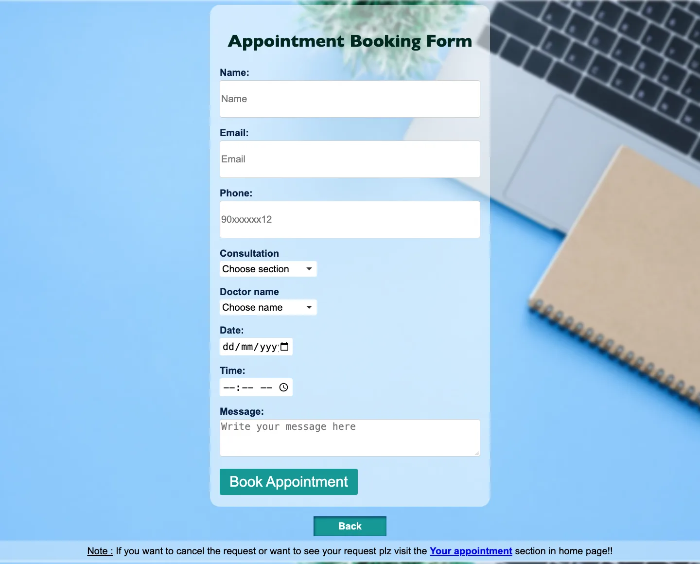
Therapist booking
Pick a consultation type (psychiatry, CBT, music therapy and more), a doctor, a date and a time. The booking is saved to Firebase.
Volunteer sessions
A separate form asks about age band, what you're facing (academic stress, mood swings, postpartum depression and others) and consent to audio recording.
Your appointments
Reads your saved therapist or volunteer booking back from the database and shows it in a table, with a toggle between the two.
Dr. Bot
A floating chat helper that explains the two tracks and answers common questions, and reads its replies aloud with the browser's speech API. Anannya built it, and I restyled the panel.
Services & plans
A home page that introduces the doctors, the services in an auto-advancing slideshow, and two membership plans.
/ 04
How it works
- Pages
- Sign up / Log in
- Home + Dr. Bot
- Booking forms
- Your appointments
- Identity
- Firebase Auth
- Email & password
- Google popup
- Data
- Firebase Realtime Database
- Appointments
- Volunteer requests
/ 05
Hard parts
- 1
Bookings that survive a refresh
The forms started out as plain HTML that forgot everything on submit. I connected each one to the Realtime Database under the user's ID, then built the 'Your appointments' pages to read that record back, so people can see what they booked.
firebase.database() .ref("Appointment Details/" + uid) .once("value") .then((snap) => renderRow(snap.val())); - 2
Reusing work under a two-day clock
Rather than design auth screens from scratch, I brought over the sign-up and login flow I'd built for Campus Exchange, restyled it for a calmer tone and added Google sign-in. That freed the team to spend its time on the booking flows and the bot.
- 3
Two Firebase SDK generations at once
Auth used the modern modular SDK while the database code used the older global one, so some pages load both. It worked, but it taught me to pick one version of a dependency at the start and stick to it across a codebase.
/ 06
Design
The sign-up screen sets the tone with a warm peach background, a cream card, deep green buttons and an illustration of a calm face with flowers growing from it. It's the most considered screen in the project, and the one I'd use as the base for everything else.
In hindsight the rest of the site doesn't follow it. The home page uses olive green and the booking forms are blue, so it reads as three products rather than one. Feedback comes through browser alerts, and the forms don't fit narrow phones. A redesign would bring everything onto the auth page's palette and make the booking flow fewer steps.
- Peach#FFD89C
- Cream#F5E3C5
- Deep green#17594A
- Olive#464E2E
- Teal#159895
/ 07
Outcome
- Shipped a working multi-page site in two days. It's still live on GitHub Pages.
- Built email and Google sign-in, and booking forms that save to and read from Firebase.
- Worked as a team through branches and two merged pull requests.
- Doctors, plans and testimonials are placeholder content, and the service was never launched to real users.
/ 08
What I learned
- Identity should come from the auth provider, not be passed between pages by hand. Listening to the signed-in user directly, and scoping database rules to that user, is simpler and safer.
- Never store anything you don't need. A booking app needs a name, a time and a contact. It shouldn't hold onto credentials or anything else sensitive.
- Sensitive topics deserve the calmest UI. A booking flow for someone in distress should have the fewest fields possible, inline confirmations instead of alerts, and the same calm palette from start to finish.
/ 09
Screens