/ 01
The problem
A first-ever event has no reputation to lean on. The chapter needed students to take a 36-hour hackathon seriously, sponsors to fund a prize pool, and everyone to know when and where to show up. It had a week to do it, and there was no existing site to build on.
One page had to do three jobs at once. It had to be an event poster that gets students excited, an info desk for the schedule, prizes, rules and FAQs, and a sponsorship deck with tiers and benefits.
/ 02
Approach
I built a single scrolling page ordered the way a student decides to sign up: what it is and when, then why it's worth 36 hours, then the timeline, then what you can win, then how to register, and only then sponsors, past events and FAQs.
I kept the stack as light as the deadline: hand-written HTML and CSS, a few lines of JavaScript for the countdown, and a small scroll-animation library. With no build step there was nothing to break on the day, and Vercel serves it instantly.
Once it was up I spent the remaining commits on performance and small screens. I swapped heavy images for compressed ones, lazy-loaded the photo collages, and made several responsive passes.
/ 03
What I built
Co-branded hero
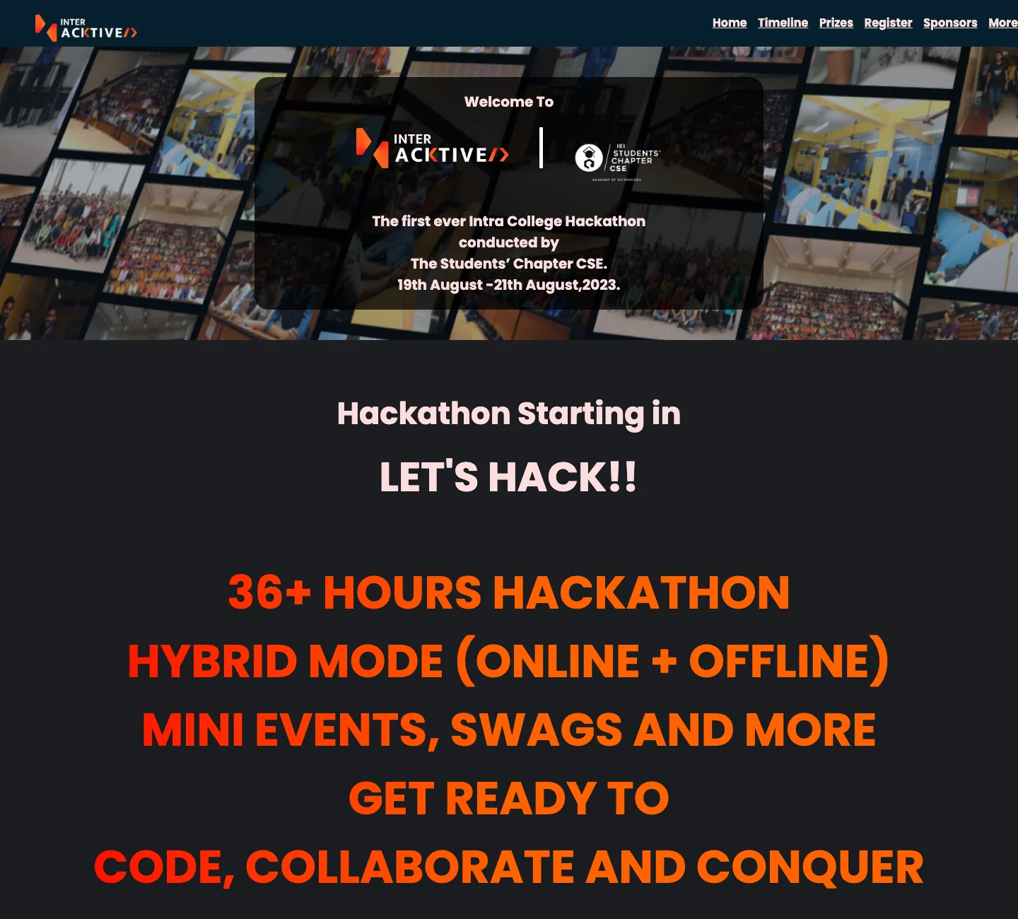
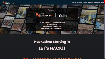
The InterHacktive and Students' Chapter logos side by side on a translucent card over a collage of past-event photos, so it's clear who's behind the event.
Live countdown
Ticks down to the opening ceremony, then switches to 'LET'S HACK!!' once the hackathon starts. Because of that, the page still reads sensibly long after the event.
Event timeline
Six milestones from the opening ceremony to prize distribution, joined by arrows that animate in as you scroll.
Prizes & flip-card tracks
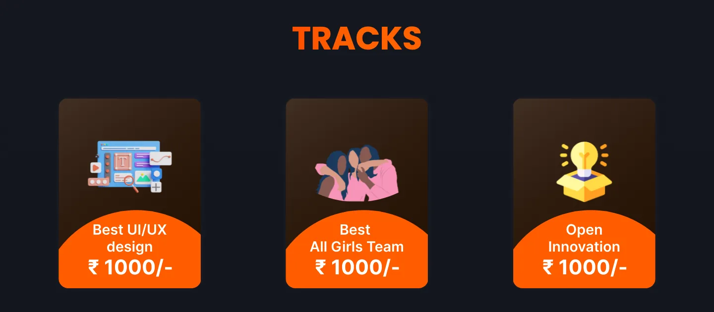
Medal cards for the podium, and track prizes (Best UI/UX, Best All-Girls Team, Open Innovation) as 3D cards that flip on hover to show the details.
Sponsorship tiers
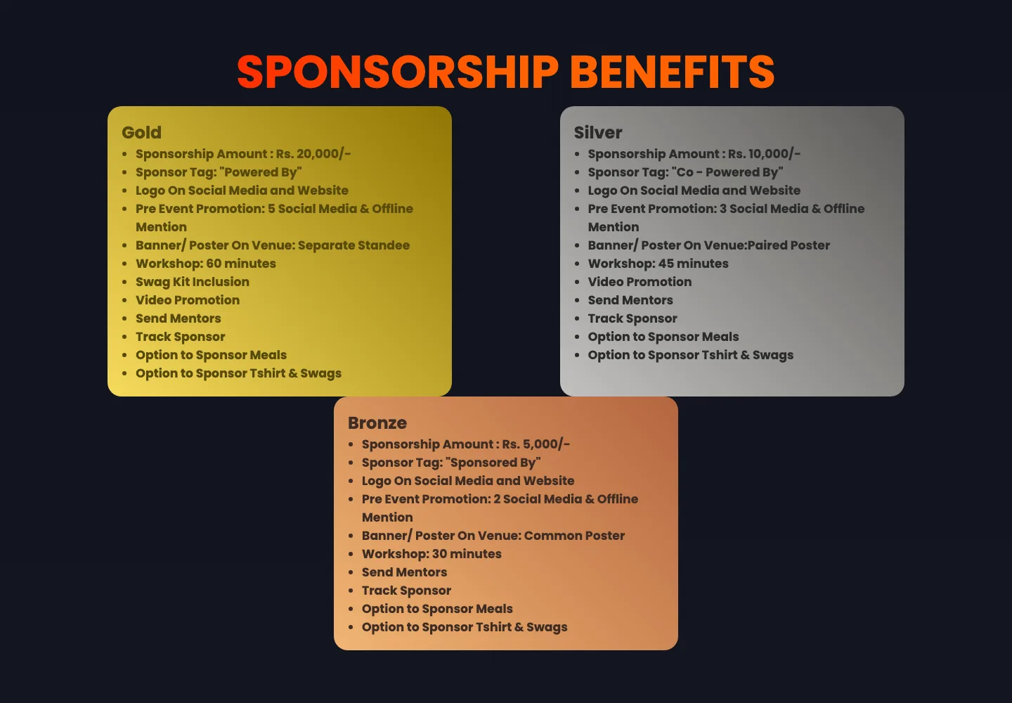
Gold, silver and bronze cards with metallic gradients and a matching glow on hover, each listing its contribution and benefits.
Credibility & FAQ
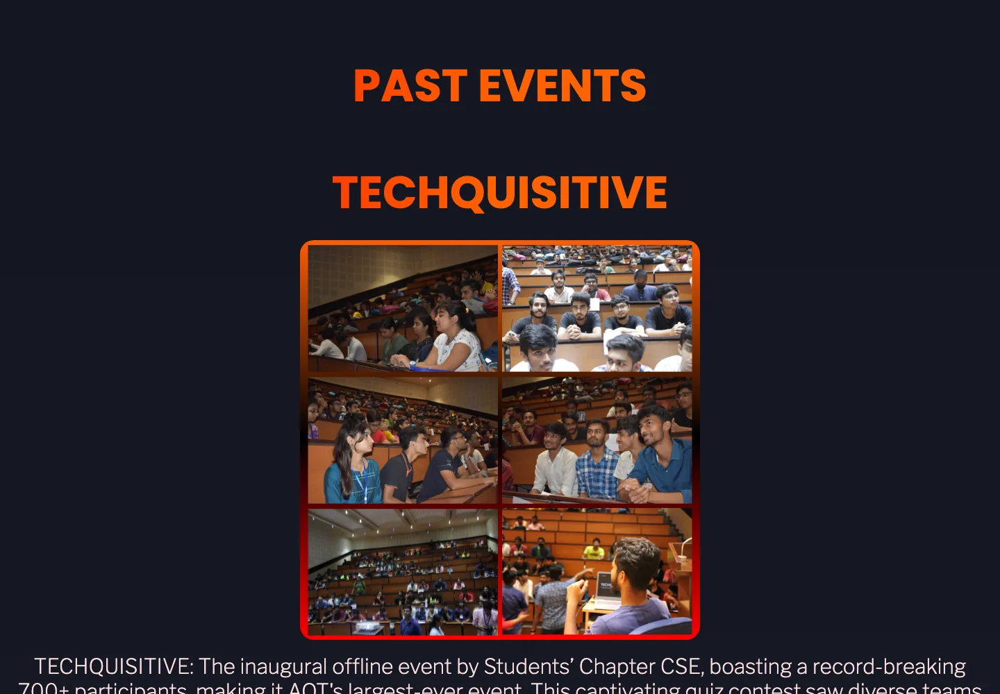
Photo collages from the chapter's past events, then native accordion FAQs covering eligibility, teams and format.
/ 04
How it works
- Page
- Semantic HTML
- Hand-written CSS
- Anchor navigation
- Behaviour
- Vanilla JS countdown
- AOS scroll reveals
- CSS 3D transforms
- Delivery
- Vercel static hosting
- Lazy-loaded images
- Google Fonts
/ 05
Hard parts
- 1
3D flip cards with zero JavaScript
The track cards flip entirely in CSS. A hover rotates the inner card 180°, and two absolutely positioned faces hide their backs, so the effect stays smooth and costs no script.
.container:hover .card { transform: rotateY(180deg); } .card { transition: transform 1500ms; transform-style: preserve-3d; } .front, .back { position: absolute; backface-visibility: hidden; } - 2
A countdown that ages gracefully
Event countdowns usually end at 00:00:00 or go negative. This one clears its timer and swaps in a call to action once the start time passes, so the page works before, during and after the event.
// simplified const x = setInterval(() => { const distance = start - Date.now(); if (distance < 0) { clearInterval(x); demo.innerHTML = "LET'S HACK!!"; return; } demo.innerHTML = `${d}d ${h}h ${m}m ${s}s`; }, 1000); - 3
Making it load fast on campus Wi-Fi
The first version shipped full-size collages and a 1.5 MB sponsor graphic. A day later I removed the heaviest assets, re-exported the collages as compressed JPGs and lazy-loaded everything below the fold, so the hero paints quickly on a crowded college network.
- 4
Small screens
Five of the nine commits are responsive passes: smaller base type, single-column prize and track cards, and the timeline arrows hidden on narrow viewports. The page still overflows on the narrowest phones. I'd rebuild it mobile-first with clamp() type and CSS grid rather than one desktop breakpoint.
/ 06
Design
The theme is hacker-night: a deep navy-black background with pale pink body text, and a red-to-orange gradient for every heading, border and button. The colour carries the energy, so the layout can stay simple. Headlines are big all-caps Poppins ('36+ HOURS HACKATHON', 'CODE, COLLABORATE AND CONQUER') against thin Libre Franklin body copy.
Motion adds to the event feel without getting in the way. Sections fade up as you scroll, track cards flip, sponsor tiers glow in their own metal colour on hover, and even the scrollbar picks up the brand gradient.
- Night#10131E
- Red#FF0000
- Orange#FF6200
- Blush#FBDEDE
- Gold tier#F6DB5C
/ 07
Outcome
- Built and shipped the site in under a week as the only developer on it.
- Still live on Vercel years later, and the countdown's end state keeps the archived page coherent.
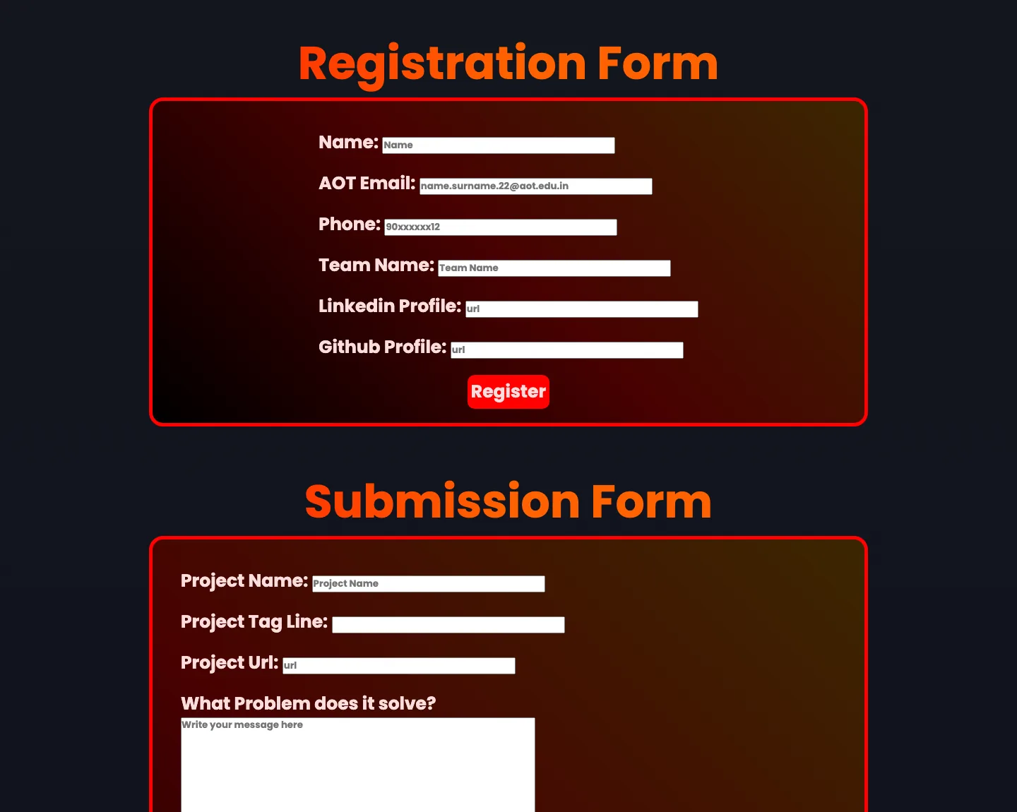
- Forms were built as interface only. A small form backend, or a link straight to the registration platform, would come first in a next version.
/ 08
What I learned
- Order the page by the reader's decision, not the organiser's org chart. Schedule and prizes come before sponsors and history.
- Pick boring technology for a hard deadline. Static HTML and CSS meant launch day had nothing to go wrong.
- Start mobile-first. Five responsive commits after the fact cost more than building small-screen layouts from the beginning.
/ 09
Screens