/ 01
The problem
Every new batch at college needs the same things: last year's notes, lab manuals, the university organiser, a drawing kit, a few textbooks. The seniors who just finished those courses have all of it, and most of it ends up in a cupboard.
The trade already happens, through WhatsApp groups and word of mouth, but you have to know the right person. Juniors pay full price for books a senior would happily sell, rent or give away, and nobody knows who has what.
/ 02
Approach
I scoped it to a single college, the Academy of Technology. That one decision answered a lot: buyers and sellers can meet on campus, so there's no shipping, and listings can show branch and year, which matters to students more than a star rating.
Then I mapped the whole exchange as screens: sign up, browse by category, open an item, place an order, talk to the seller and agree on a pickup. I added two flows that a normal shop doesn't need. Seniors list items to sell, rent or donate, and juniors post requests for things nobody has listed yet, which a senior can answer with one tap.
I designed the screens and built them as a static site on GitHub Pages, with Firebase handling real accounts. A teammate built the individual product pages in parallel, working through pull requests.
/ 03
What I built
Real accounts
Email and password sign-up, login and logout through Firebase Auth. These work on the live site and are wired into every page.
Browse by category
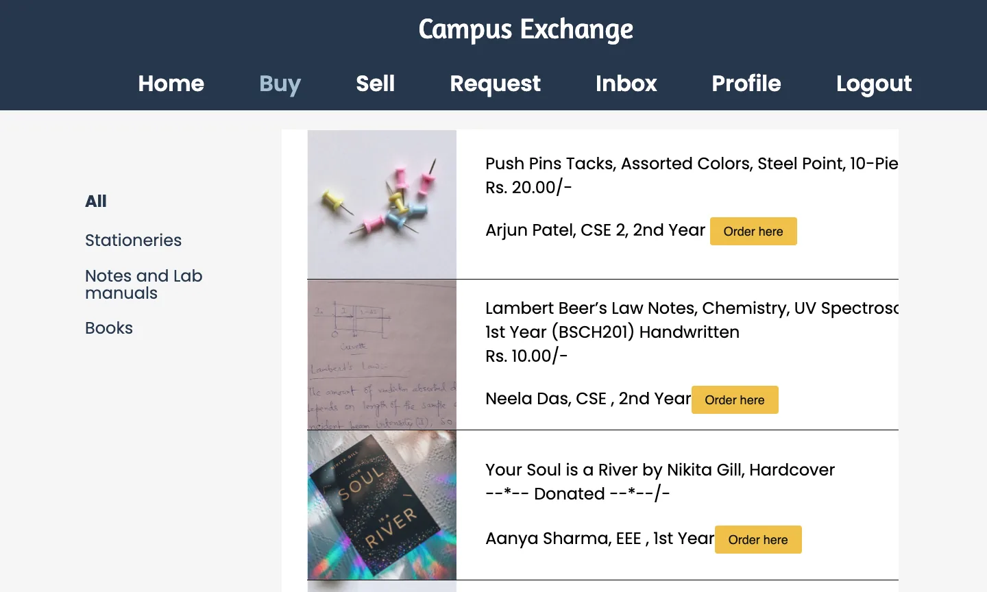
Stationery, notes and lab manuals, and books, each with its own listing page and a sidebar to switch between them.
Sell, rent or donate
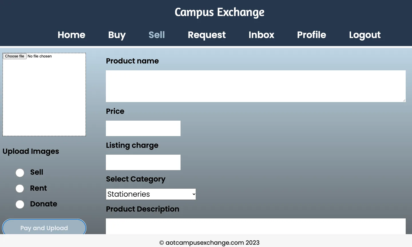
One listing form covers all three: photo, price, category and description, with a sell, rent or donate toggle.
Requests board
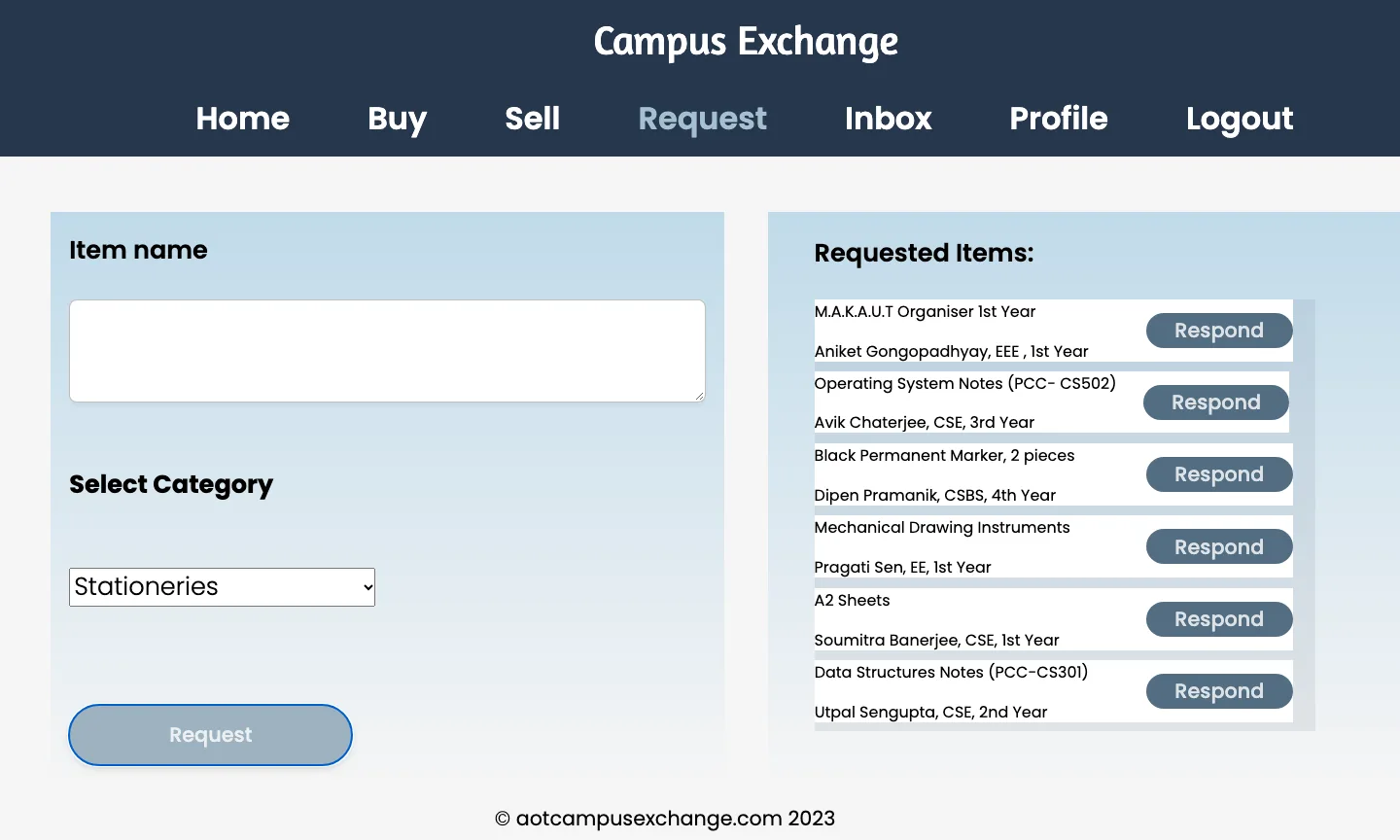
Juniors post what they're looking for, such as 'Operating System notes (PCC-CS502)'. Each request has a Respond button that takes a senior straight to the listing form.
Seller context on every listing
Each listing shows the seller's name, branch and year next to the price or a 'Donated' or 'Rented' label, so you know who you'd be meeting.
Inbox for pickups
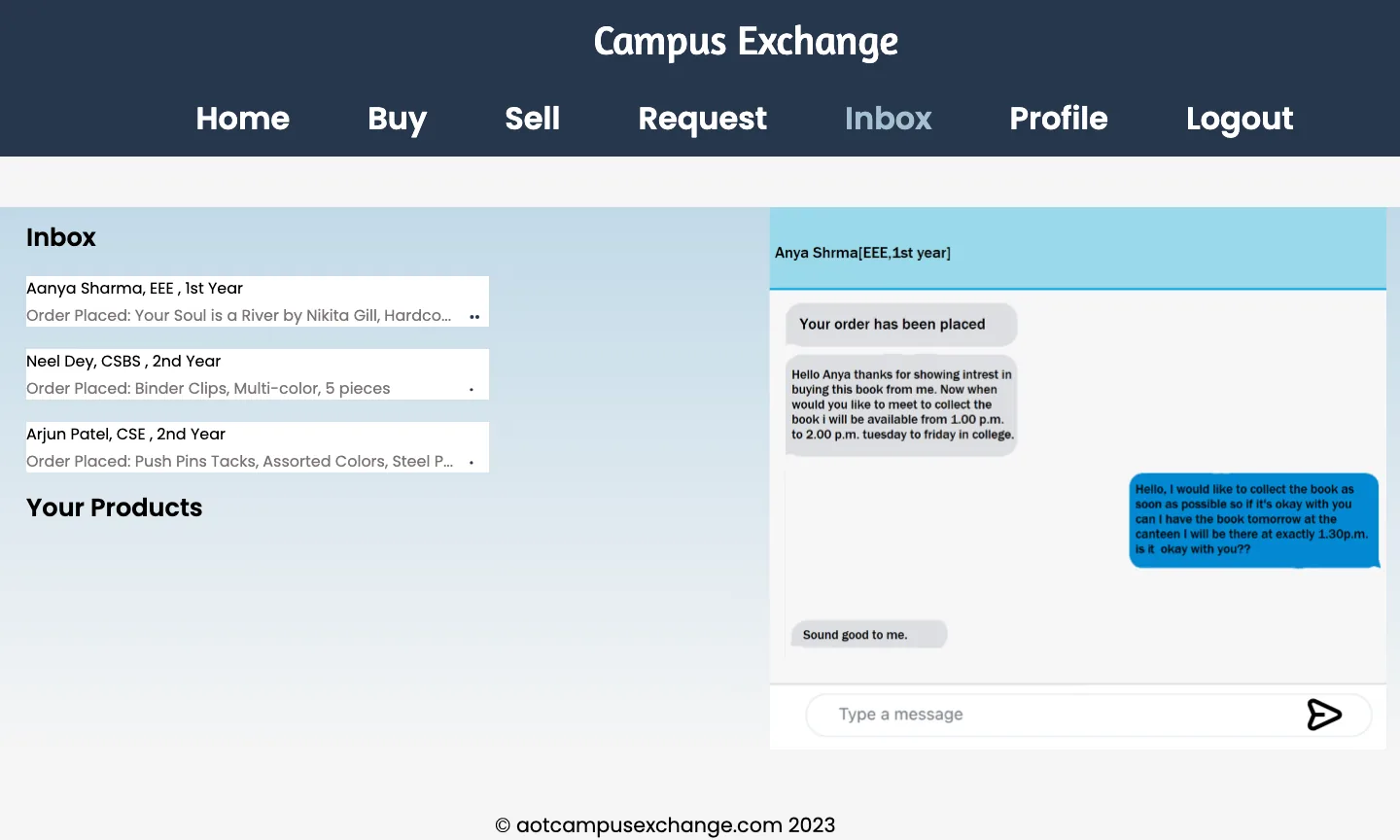
Orders open a conversation with the seller to arrange a time and place on campus. In this prototype the conversation is a designed mock-up, not live chat.
/ 04
How it works
- Pages
- 26 static HTML pages
- 14 stylesheets
- GitHub Pages
- Behaviour
- Vanilla JS modules
- Page-to-page navigation
- Identity
- Firebase Auth v9
- Email & password
- Analytics
/ 05
Hard parts
- 1
Real auth on a site with no build step
I wanted real accounts without a bundler or a server. Each page imports the Firebase v9 modules from the CDN in a native ES-module script, which keeps the site to plain files that GitHub Pages can serve.
<script type="module"> import { initializeApp } from "https://www.gstatic.com/firebasejs/9.10.0/firebase-app.js"; import { getAuth, signInWithEmailAndPassword } from "https://www.gstatic.com/firebasejs/9.10.0/firebase-auth.js"; const auth = getAuth(initializeApp(firebaseConfig)); signInWithEmailAndPassword(auth, email, password) .then(() => (window.location.href = "./HomePage.html")); </script> - 2
Paths that broke after deploying
Links between login and sign-up worked locally but failed once the site was served from a /CampusExchange/ subpath on GitHub Pages. Several commits went into fixing that switch, including a fallback to the absolute URL.
- 3
Designing a closed loop, not just a shop
A plain storefront would leave juniors stuck whenever nobody had listed what they needed. The requests board closes that gap. A request is a prompt to a senior, and Respond drops them into the listing form, so demand turns into supply.
/ 06
Design
The palette is calm navy and steel blue on an off-white page. It reads more like a campus notice board than a sale, with one warm mustard colour kept for the action that matters, 'Order here'. The wordmark is set in Amaranth, and everything else in Poppins.
The layouts borrow patterns students already know. Listings are image-left rows with price and seller, the requests page puts the form next to the live board, and the inbox is a two-pane messenger.
Looking back with a critical eye: the screens use fixed-pixel layouts and don't adapt to phones, which is where students would actually use this. The navigation uses click handlers on headings rather than real links, which shuts out keyboard and screen-reader users. A rebuild would fix both first.
- Navy#27374D
- Slate#526D82
- Steel#9DB2BF
- Mist#DDE6ED
- Order#F0C14B
/ 07
Outcome
- Designed and shipped a 26-page prototype in four days. It's still live on GitHub Pages.
- Built working Firebase sign-up, login and logout across the site.
- Collaborated through branches and two merged pull requests, including resolving conflicts.
- Not yet built: saving listings and requests to a database, and live messaging between buyers and sellers. Those are the next milestones.
/ 08
What I learned
- Scope is a design tool. Limiting it to one college removed shipping, payments and trust problems before any code was written.
- A prototype should say what it is. Designed screens are a good way to test a flow, but in a product people would actually use, every screen needs data behind it.
- Responsive and accessible from the start. Retrofitting fixed-pixel layouts and heading-based navigation costs more than building with flex, grid and real links from day one.
/ 09
Screens